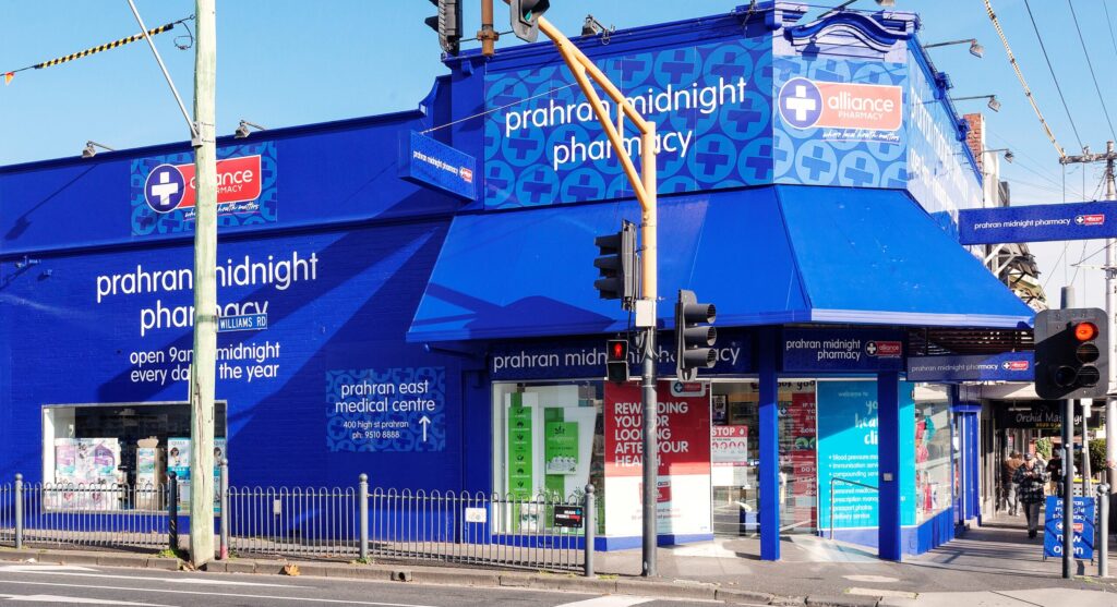

When customers walk past your pharmacy, you only have a few seconds to draw their attention. With the right look, image, product, and presentation, you can excite them and lure them in. It is important to ensure your pharmacy, and primarily its storefront, is attractive.
We are enjoying the new layout within the store – making it easier for staff and customers to navigate and access areas of the store. The movement of some of our key categories out from behind the counter, onto the shop walls should benefit sales in years to come.
We had some unusual shaped gondolas that were acting like roadblocks before and many important products were not visible to customers. We now have great new internal and external signage throughout. It has made the store look brighter, fresher, and more professional. The matching category signage also assists with navigation and product selection.
The vivid blue on the outside of the building makes an immediate impact. We trade to midnight every day and it looks fantastic lit up under our new LED spotlights and neon signage.
We have received many positive comments from our customers telling us that we love what we have done with the store. Local businesses told us they loved watching the transformation over the installation week. One of our local GPs told me they love the colour choice.
Our loyalty rewards program is growing beyond my expectations. Hopefully, the new signage has attracted some new customers – as the building was looking pretty tired and outdated before.
As an owner I am also enjoying the ability to run a catalogue program where the hard work is done for us and the implementation of each catalogue is quite a simple process for my staff.
Daniel
Owner, Prahran Midnight Pharmacy


